Containers Dialog
Overview & Core Setup
Dialog script containers allow you to define native Paper API UI screens rendered on the client side.
Anatomy of a Script
Structure
my_dialog:
    type: dialog
    base:
        type: multi
        title: <gold>Header Title
    bodies: ...
    inputs: ...
    buttons: ...
Universal Base Properties
typeRequired
The layout engine:
multi, list, confirm, or notice.titleRequired
The main header. Supports tags and MiniMessage.
external titleOptional
The window title in the client's OS frame.
can close with escapeOptional
Boolean. If
true (default), ESC closes the window.
Containers Dialog
Layout: Multi
A versatile form layout. Supports multiple inputs and custom buttons.
Multi-specific `base:` Properties
columnsOptional
Integer. Arrange elements into grid columns.
exit buttonOptional
A button definition block used as a dedicated close button.
Multi-specific Root Properties
buttons:Required
A map of action buttons at the bottom.
Containers Dialog
Layout: List
Designed to display buttons that open other dialog scripts.
List-specific `base:` Properties
columnsOptional
Integer. Columns in the grid.
button widthOptional
Integer. Sets a fixed pixel width for auto-generated buttons.
exit buttonOptional
A button definition block used as a dedicated close button.
List-specific Root Properties
dialogs:Required
A list of script names to display.
Containers Dialog
Layout: Confirm
A simple confirmation box with two actions.
Confirm-specific Root Properties
yes:Root
Affirmative ActionButton definition.
no:Root
Negative ActionButton definition.
Containers Dialog
Layout: Notice
A simple alert box.
Notice-specific Root Properties
button:Root
Optional ActionButton definition. If omitted, creates a default "OK" button.
Containers Dialog
Components: Inputs
Inputs defined under inputs:. Values available via <context.key_name>.
Text Input (type: text)
width
Field width.
max length
Limit characters.
initial
Default text.
label visible
Boolean. Show/Hide the label.
multiline options
Section with
max lines and height.Boolean Input (type: boolean)
initial
Default state (true/false).
on true / on false
Labels for ON/OFF states.
Number Input (type: number)
start / endReq
Range bounds (Float).
step
Increment step.
initial
Starting value.
width
Slider width.
label format
Format string (e.g.
"Val: %s").Single Choice (type: single)
options:Req
Map of options (
id, display, initial).label visible
Boolean.
Containers Dialog
Components: Bodies
Defined under bodies: root key.
type: message
•
•
message: The text.•
width: Fixed width.
type: item
•
•
•
•
item: ItemTag.•
width / height: Visual size.•
show tooltip / decorations: Booleans.•
description: Nested message-type body.
Containers Dialog
Buttons & Actions
Common properties and action types.
labelReq
Button text.
tooltip
Hover text.
width
Button width.
Action Types (type:)
SCRIPT
Key:
script:. Runs Denizen commands.RUN_COMMAND
Key:
command:. Runs a player command. Must include slash (/).OPEN_URL
Key:
url:. Opens a link.COPY_TO_CLIPBOARD
Key:
text:. Copies text.
Containers Dialog
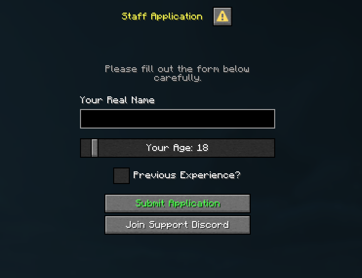
Full Example
staff_application.dsc
st:
    type: dialog
    base:
        type: multi
        title: <yellow>Staff Application
        columns: 1
    bodies:
        header:
            type: message
            message: <gray>Please fill out the form below carefully.
    inputs:
        1:
            type: text
            label: Your Real Name
            key: applicant_name
        2:
            type: number
            label: Your Age
            start: 13
            end: 99
            initial: 18
            step: 1
            key: applicant_age
        has_experience:
            type: boolean
            label: Previous Experience?
    buttons:
        1:
            label: <green>Submit Application
            script:
            - narrate "Name: <context.applicant_name>"
            - narrate "Age: <context.applicant_age>"
            - narrate "Experience: <context.has_experience>"
        2:
            type: OPEN_URL
            label: Join Support Discord
            url: https://discord.gg/example
Events
player connection configure
Triggers when a player's connection is being configured (Paper specific).
Contexts
<context.connection>
Returns the
ConnectionTag associated with the joining player.Determinations
WAIT
Determine
Determine
Delays the configuration process for up to 1 minute. During this time, you can show Dialogs or process backend tasks. If not finished manually via
connect mechanism within 1 minute, the connection will be dropped.
Objects
BiomeTag
Additions for interacting with Biomes.
Tags
<BiomeTag.sky_color>
Returns the
ColorTag of the biome's sky color.<BiomeTag.sky_light_color>
Returns the
ColorTag of the biome's skylight color.Mechanisms
sky_color
Input: ColorTag
Input: ColorTag
Sets the biome's sky color permanently.
sky_light_color
Input: ColorTag
Input: ColorTag
Sets the biome's skylight color permanently.
Objects
ConnectionTag
Methods and properties for interacting with client connections.
Tags
<ConnectionTag.uuid>
Returns the
ElementTag containing the player profile's UUID associated with this connection.<ConnectionTag.name>
Returns the
ElementTag containing the player profile's name associated with this connection.Mechanisms
connect
Input: None
Input: None
Confirms the connection and allows the player to continue the login process. Use this to finish the configuration stage once your requirements are met.
disconnect
Input: ElementTag
Input: ElementTag
Disconnects the connection with a specified reason. Supports Paper-formatted text (MiniMessage/Legacy).
show_dialog
Input: ElementTag
Input: ElementTag
Shows a specific dialog to the connection using the exact name of a Dialog script container.
close_dialog
Input: None
Input: None
Closes any currently open dialog for this specific connection.
Objects
PlayerTag
Additions for interacting with Players.
Mechanisms
show_dialog
Input: ElementTag
Input: ElementTag
Shows a specific dialog to the online player using the exact name of a Dialog script container.
close_dialog
Input: None
Input: None
Closes any currently open dialog for the online player.